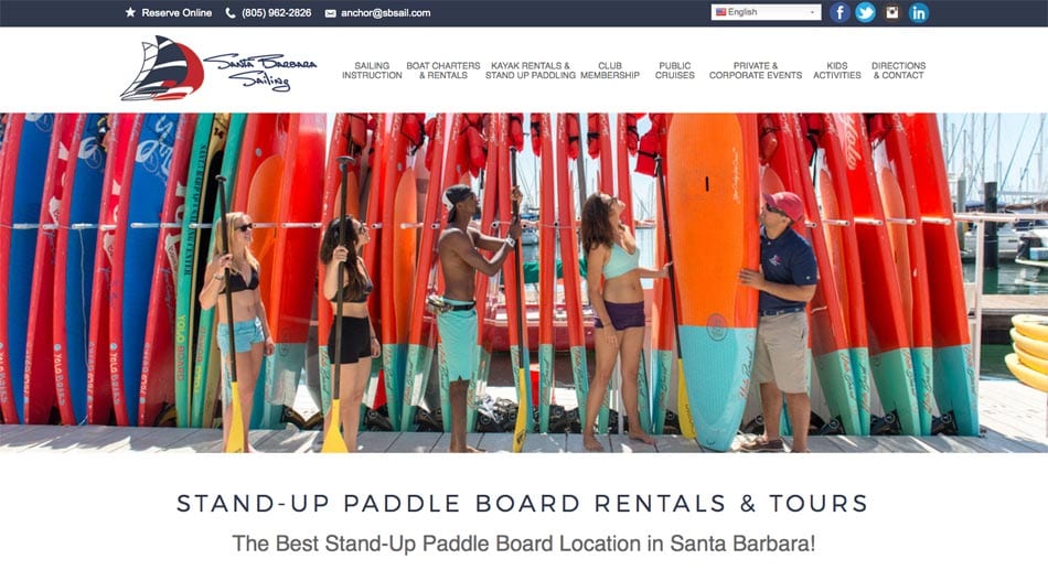
Santa Barbara Sailing Center Sets Sail with a New Look

After working with the Santa Barbara Sailing Center for over ten years, we were thrilled when they decided they were ready for a new look. Their business had grown a lot during that time, and their Dreamweaver site was outdated and was not a good reflection of the fun and professional vibes which made them so successful. It was time for a re-design.
The main goal was to consolidate the pages to lessen the amount of clicks it took to get to the crux of the important information. Our team offered the SBSC crew 6 different designs to use throughout the site in order to effectively display their services, schedules, special packages, and pricing. To further highlight their awesome business, the SBSC invested in a photo shoot with local photographer Kevin Steele, providing us with beautiful high resolution images to use throughout the site. There was no stock photography used at all.

The result is a clean, elegant and classy website that is user-friendly and appealing to all audiences. Perhaps the most exciting feature of this new site is what you cannot see; the custom coding and templates that we created to make it very easy for the client to update the site themselves. The unique “plug and play” features allow the crew at the SBSC to not only make updates on their own, but they can add fresh content as well, truly putting them at the helm of their own website. Complete with links to a 3rd party Ecommerce booking agent, a high resolution photo gallery and search engine optimization, the new Santa Barbara Sailing Center website illustrates how much fun awaits you on the water.
